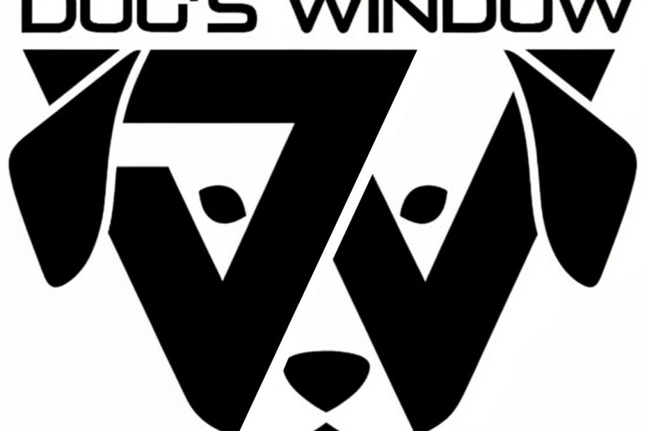
You’ve known us as Dog’s Window for a while, but as we looked ahead to a big year of changes, we realized something was missing. While our name said “Dog,” our logo was a bit too quiet about it.
The Design Journey
When we sat down to “tweak” the logo, we didn’t want to just slap a random clip-art puppy onto our labels. We wanted something that felt like it had been there all along.
The design process was all about hidden details. We spent weeks playing with lines and negative space, trying to find a way to honor our name without losing the clean, modern look you recognize. We went through dozens of sketches—some too literal, some too abstract—until we hit on the “Aha!” moment.
The “DW” Marks the Spot
The breakthrough came when we looked at the geometry of our name. By subtly integrating the “little dog” into the structure of the logo (take a close look at those ears and the ‘DW’ shape!), we found a way to let the mascot emerge naturally.
More Than Just a Logo
This isn’t just about a fresh coat of paint. Adding the dog represents the friendly, loyal, and approachable spirit we try to pour into every pint. Whether you’re a regular or a first-timer, we want you to feel that same “man’s best friend” welcome every time you see that face on a tap badge.
This is the first of many exciting shifts coming to the brewery this year. We’re evolving, but we’re staying true to our pack.
